Your announcement bar is probably the cheapest real estate on the storefront, and the easiest to waste.
A thin strip at the top can carry free-shipping thresholds, launch dates, or a single campaign code. It can also train shoppers to tune you out: same neon bar, same vague “SALE,” same layout jump when the bar loads three seconds late. I’ve seen all of that on stores I’ve repaired. The fix is rarely “make it flashier.” It’s clear message, stable layout, and placement that matches how people actually scan the page.
This guide is how I think about Shopify promo banners when I’m refining a theme or scoping bar work for a client. No app catalog. Just patterns you can implement in the theme editor, a bit of CSS, or a focused app when the theme bar genuinely isn’t enough.
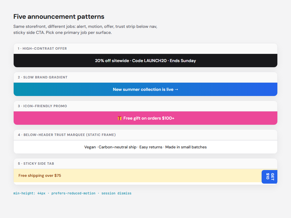
What the bar is for (before you pick colors)
Pick one primary job per bar:
| Job | Good fit | Watch out for |
|---|---|---|
| Offer | Limited-time code, BOGO window | Stacking with automatic discounts |
| Threshold | “Free shipping over $X” | Changing cart totals by market |
| Trust | Vegan, made in USA, easy returns | Replacing product proof on the PDP |
| Navigation | “New collection →” | Competing with main nav |
If you mix all four in one rotating strip, most people read none of it. Rotate related messages (shipping + returns), not unrelated ones (sale + careers + podcast).
Copy rule: one line, one action. “Free shipping over $75 · Shop bestsellers” beats “BIG SALE HAPPENING NOW CLICK HERE.”
1. High-contrast bars that still feel like your brand
Contrast gets attention; off-brand neon erodes trust. Use your primary accent on a neutral or inverted header background, and keep body text at a readable size (14-16px on desktop, never below 13px on mobile).
Small icons (gift, truck, clock) help scanning when they reinforce the words, not when they replace them. Emoji can work for D2C lifestyle brands; for B2B or regulated categories, stick to SVG icons.
In Shopify: Online Store → Themes → Customize → Announcement bar. Set background and text to match your design tokens; link the whole bar or add a short CTA if your theme supports it.
2. Reserve space so the bar doesn’t jump the page
Late-loading bars are a conversion killer. Content shifts when someone is about to tap “Add to cart,” and Google’s Cumulative Layout Shift (CLS) metric penalizes unstable headers.
Reserve height up front, even before dynamic content arrives:
.shopify-section-group-header-group .announcement-bar,
.promo-banner {
  min-height: 44px; /* tune to your line count */
  display: flex;
  align-items: center;
  justify-content: center;
}
For responsive strips with variable copy, aspect-ratio on a wrapper keeps proportions stable:
.promo-banner__inner {
  aspect-ratio: 24 / 1;
  width: 100%;
  max-height: 56px;
}
Use a subtle placeholder background (#f4f4f5 on light themes, #18181b on dark) so the slot never flashes empty white.
3. Motion: gradients and animation with an off switch
Animated gradients (soft shifts between two brand colors) draw the eye without screaming. They work well for single-message bars during a launch week.
Rules I use:
- Duration: 8-15s loops; faster reads as cheap.
- Accessibility: honor
prefers-reduced-motion: reduceand show a static gradient or solid fill. - Performance: animate
background-positionor use CSS@keyframeson opacity between two stops, not heavy box-shadow pulses.
@media (prefers-reduced-motion: no-preference) {
  .promo-banner--gradient {
    background: linear-gradient(90deg, #0891b2, #2563eb, #0891b2);
    background-size: 200% 100%;
    animation: promo-shift 12s ease infinite;
  }
}
@keyframes promo-shift {
  0%, 100% { background-position: 0% 50%; }
  50% { background-position: 100% 50%; }
}
If you need marquee or vertical rotation, treat motion as optional enhancement: the message must make sense when frozen.
4. Scrolling value props vs scrolling discounts
Horizontal marquees are trendy; the strategic choice is what scrolls.
- Discount marquee: “20% off · Ends Sunday · Code SAVE20” works in peak promo weeks; fatigues quickly elsewhere.
- Value marquee: “Small-batch · Plastic-free shipping · 30-day returns” builds trust between campaigns; pairs well with single-SKU or hero-product brands.
Nutrition and single-SKU brands often use the second pattern so the bar educates instead of only shouting. Match scroll speed to reading comfort (~40-60px/s on desktop; test on mobile).
5. Rotating messages without cognitive overload
Vertical or cross-fade rotation lets you show three offers in one slot. Color changes per slide can work when each slide is one short clause and transitions are slow (4-6s visible per message).
- Max 3 slides in rotation during a sale; 2 otherwise.
- Same typography every slide; only background or accent may change.
- Pause rotation on hover/focus so keyboard users can follow links.
Theme-native bars usually don’t rotate; that’s where a lightweight announcement app or a small custom section is justified, after you’ve validated the copy in a static bar.
6. Sticky side tabs: visible, not hostile
Side-sticky “Get $10” tabs can lift email or referral signups. They fail when they cover product galleries on mobile or fight with accessibility widgets.
If you use them:
- Collapse to a small chip on viewports under 768px.
- Don’t animate every second; a gentle entrance once per session is enough.
- Mirror the same offer in the top bar for consistency, or pick one surface, not both competing.
7. Placement: top vs below the header
Most themes default to above the logo. That’s correct for store-wide alerts (shipping delays, sitewide sale).
Below the navigation can reduce “banner blindness” for returning customers who’ve learned to skip the top strip. Tradeoff: you lose vertical space on small laptops.
In the theme customizer, drag Announcement bar below Header in the section order and measure:
- Click-through on bar links
- Bounce rate on landing pages
- CLS and LCP (below-nav bars sometimes load with header JS. Watch for shift)
Always offer dismiss (×) for non-critical promos, and persist dismissal in sessionStorage so you’re not nagging the same session.
What to test (small changes, measurable wins)
You don’t need a hundred variants. Run one change at a time for a full business week:
- Message: threshold vs percentage off (same visual design).
- Placement: above header vs below nav.
- Motion: static vs slow gradient (with reduced-motion fallback).
- Link target: collection vs cart with pre-applied discount (only if your stack supports it cleanly).
Track bar CTR, add-to-cart rate from landing pages, and whether support tickets mention “confusing discount” copy. That last one matters more than click rate.
Theme bar, custom Liquid, or app?
| Need | Start here |
|---|---|
| One message, occasional edits | Theme announcement bar |
| Market-specific copy, scheduling | Theme locales + manual schedule, or app |
| Marquee, countdown, geo rules | One vetted announcement app (avoid stacking three) |
| Complex discount logic | Discount functions / app like DigiChop PromoDiscounts. The bar is only the billboard |
I bias toward theme and CSS first so performance and brand control stay in your repo. Apps earn their place when merchandisers need rotation, timers, or targeting without opening a ticket for every campaign.
Bottom line
Promo banners are not decoration. They’re a promise at the top of the funnel: shipping, urgency, or trust. Make them on-brand, stable on load, respectful of motion preferences, and honest about one action. Test placement as seriously as you test button color.
If your bar works but checkout discount stacking doesn’t, that’s a different problem, and one worth fixing before you spend another month optimizing the strip.
chopsuey.dev
Shopify development, websites, and workflow automation for stores that outgrew templates. Projects → · Let’s talk →
Related: migration and promo copy on client projects; campaign tooling in DigiChop PromoDiscounts.