Product discovery that matches the brand and converts on mobile.
+33%Collection CTR (Featured items)
+56%Filter usage (Category filters)
-21%Mobile bounce (Listing pages)
-27%Time to product (Faster browse)
Project visuals
Screenshots from the build in a bento grid. Tap a tile to highlight it.
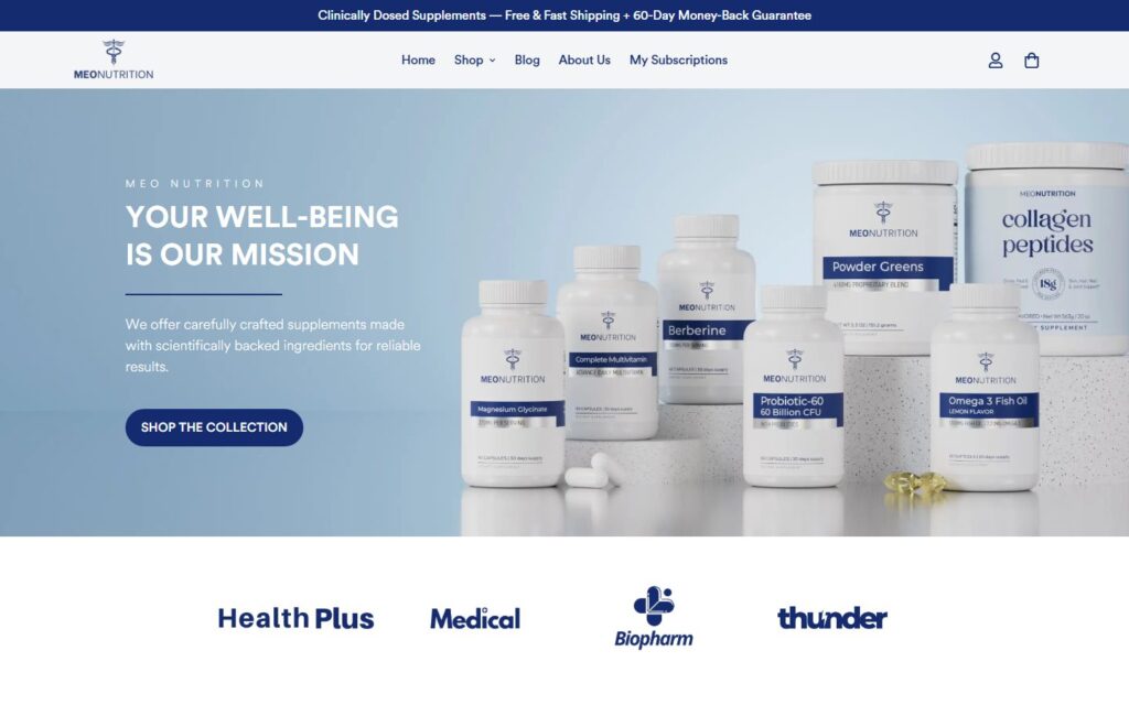
Meo Nutrition homepage
The challenge
Meo Nutrition's catalog was growing, but the default collection experience made it hard for customers to scan products, compare options, and find featured items. Mobile shoppers especially faced friction discovering the right products.
Flat collections
Standard grids did not highlight hero products or guide browsing paths.
Weak filters
Customers could not narrow by category or benefit without scrolling endlessly.
Brand drift
Listing pages did not reinforce Meo's visual identity or product story.
How we approached it
- Grid redesign. Customized product grid layouts with spacing, typography, and card treatments aligned to the brand.
- Filter enhancement. Improved category filters and collection structure so shoppers reach relevant products faster.
- Merchandising layer. Added badges and labels for featured items, plus metadata optimizations for discoverability.
Key deliverables
Listing UX
- Custom product grids
- Enhanced filters
- Featured badges
Discoverability
- Structured collections
- Optimized metadata
- Mobile-responsive cards
Outcomes
Faster browsingCustomers find products with less scrolling and fewer dead ends.
Brand alignmentListing pages feel intentional, not like a default theme.
Mobile parityGrid and filter experience works cleanly on small screens.
Merchandising controlTeam can highlight key products without custom dev each time.
Stack and tools
Shopify LiquidCollection templatesCSS GridMerchandisingSEO